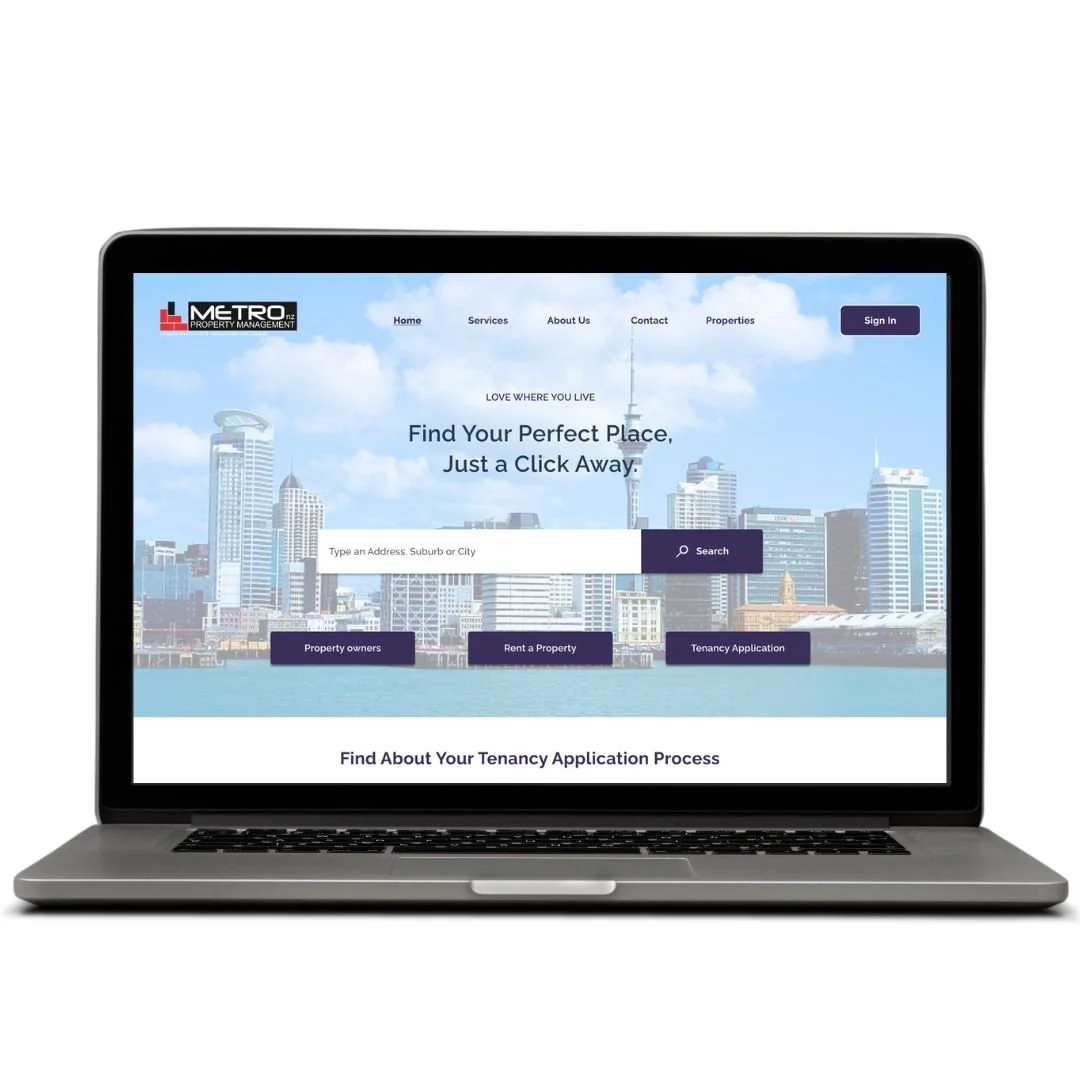
Simplified Rental Process for Tenants and Property Agents
Re-designing a new rental & tenancy experience for Metro NZ property management
Overview
As a UI/UX Designer, I've had the opportunity to work on the complete redesign of Metro NZ property management's home page, rental search and tenancy services web application. Through this case study, I delve into the intricate design process, uncovering the motivations and methodologies driving the enhancement of Metro NZ property management services.
DURATION: 3 Weeks
ROLE: UI/UX Designer
PROCESS: UX Research, Product Strategy, Visual Design.
About the product
Metro NZ property management serves as a gateway to their advanced property services, which aims to simplify the rental process for both individuals and property agents in NZ. Through a Software as a Service (SaaS) platform, users can efficiently manage their rental search and tenancy application.The company's commitment to enhancing accessibility and usability in the often customers particularly those from overseas or during situations like the Auckland COVID-19 lockdown makes it a valuable resource for individuals seeking efficient, user-friendly property search.
Who are the users ?
The user category and primary user persona encompass a wide array of individuals: every individual seeking to rent a property in New Zealand. This user persona embodies the typical New Zealand property seeker, someone who values simplicity and clarity in their rental search process. They expect a digital platform that simplifies the otherwise complex task of finding and applying for rental properties online, offering convenience and efficiency in the tenancy application process.
Understanding the user journey for Metro NZ
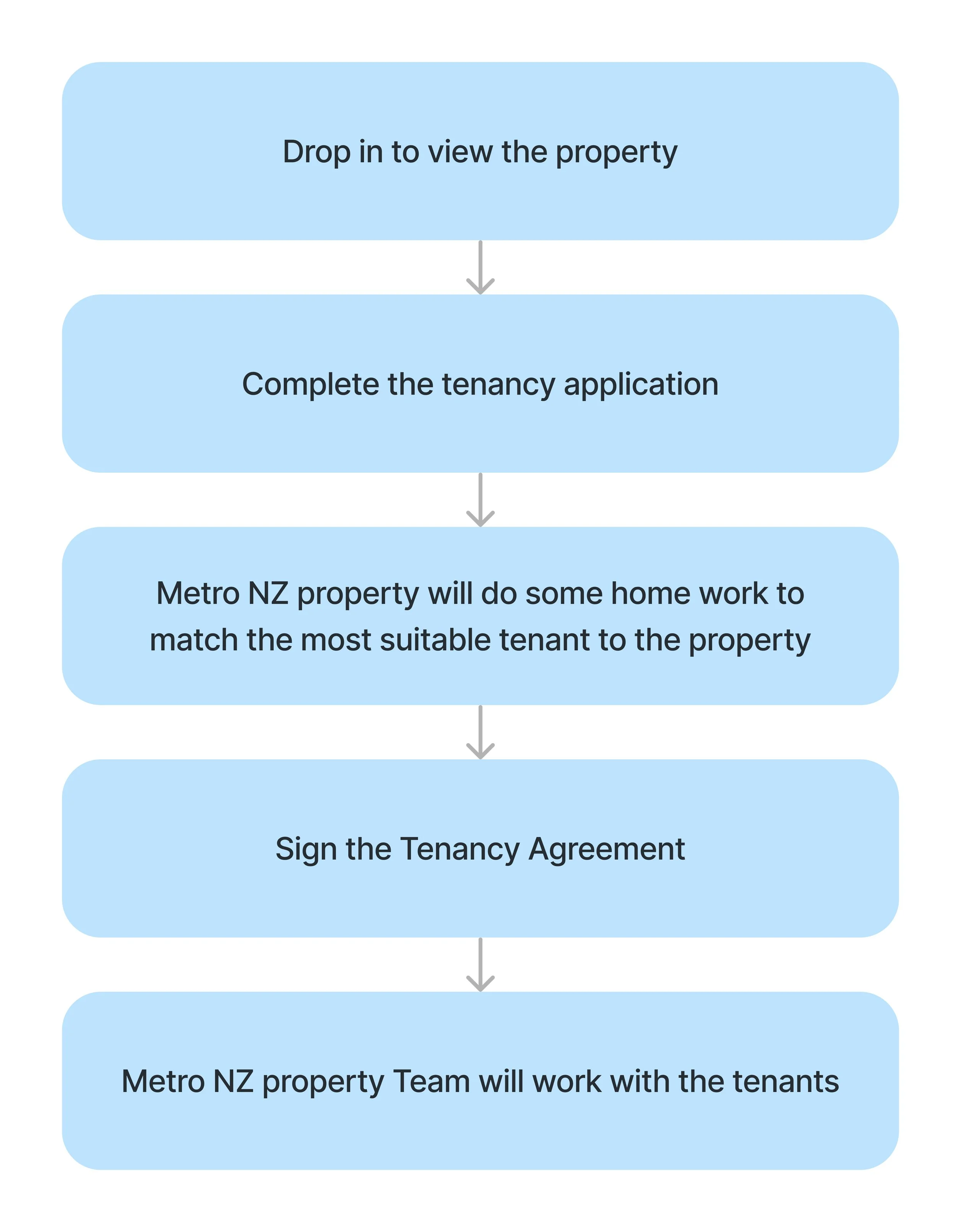
Renting a house in New Zealand involves a series of steps. This includes searching for properties, viewing them, applying with personal details, undergoing background checks, signing a tenancy agreement, paying a bond, inspecting the property before moving in, making regular rent payments, communicating maintenance issues, and giving notice when ready to move out.
Before I delve deep into the case study, it's important to visualise the existing steps to rent property & apply for tenancy. Click here for more detailed user flow.
Exploring the problem landscape
Over time and with user feedback, it became evident that the product had accumulated what is commonly known as "design and engineering backlog." This backlog encompasses various issues such as user experience challenges, navigation complexities, and the lack of a consistent design language.
“I can’t find a section where I can search for the properties to rent”
“The services are loaded with too much information. I don’t feel like reading it. The home page is too noise. I don’t know where to start”
“Do I have to call to book an appointment, or should I apply online?”.
“I would like to search around before I decide to be a tenant. The tenancy application button sounds like I have to make a commitment”.
Customer feedbacks
User Painpoints
By synthesising user feedback, analysing data, and conducting user audits for insights, we gained valuable information about the challenges users faced. These insights revealed prominent pain points that led to user drop-offs.
#1: Process of finding the rentals is complex
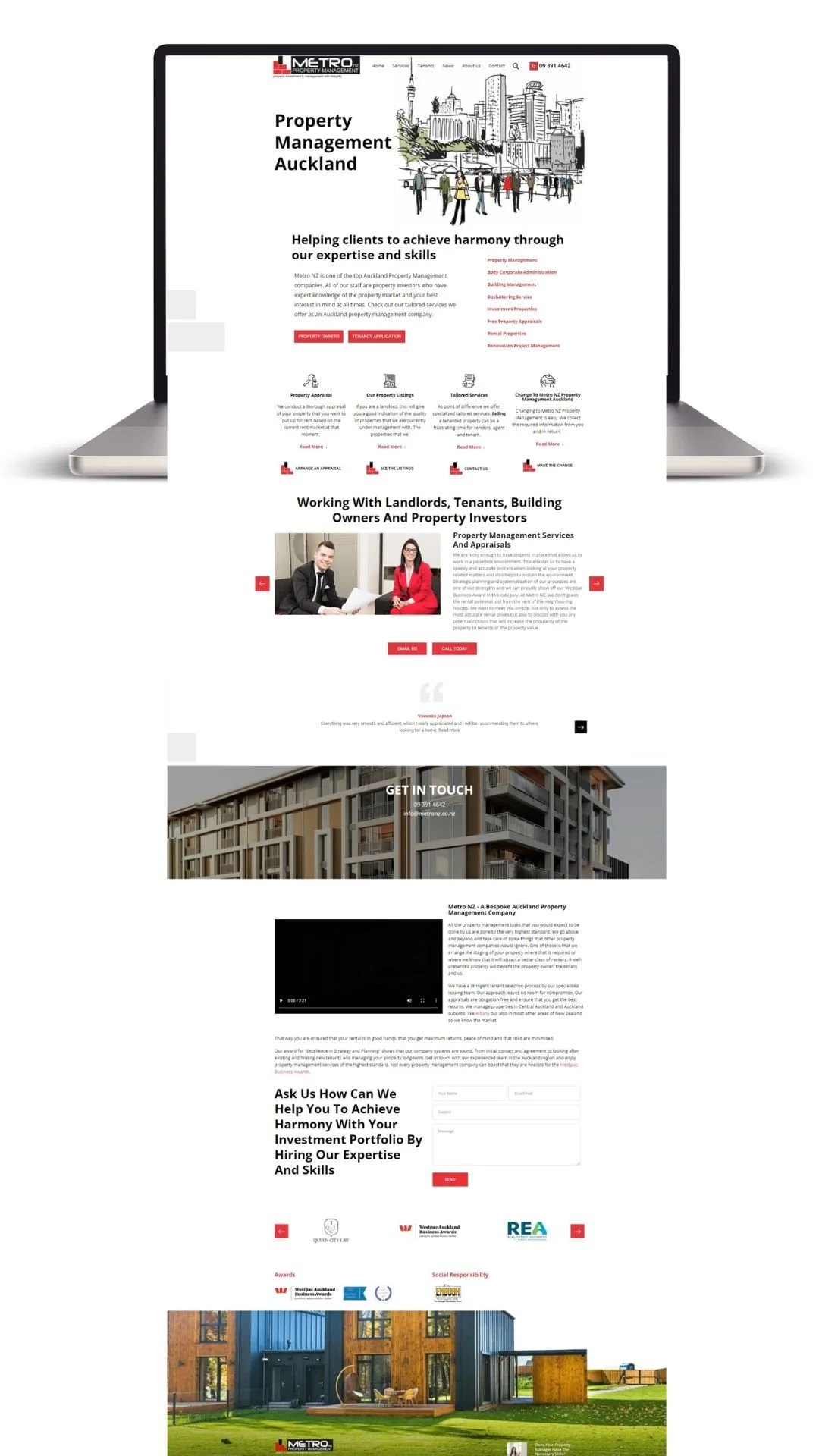
On this screen, the user is on the landing page, searching for rental property listings. Although these listings are located under the services menu in the navigation bar and also appear in the list of categories, their visibility is obscured.
Furthermore, upon selecting rental listings, users are presented with comprehensive information, However, the inability to view the actual rental listings poses a challenge, detracting from the overall user experience.
This lack of clarity hinders users from easily identifying the categories for rental listings, resulting in confusion and contributing to user drop-offs.
Old Product
#2: Unnecessary prompt for tenancy application
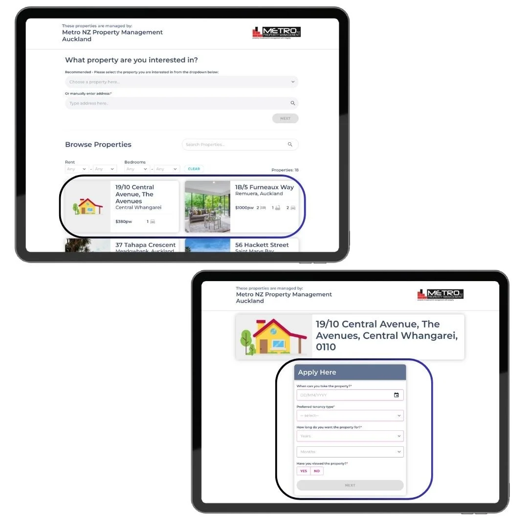
On clicking on the tenancy application button on the landing page, they're directed to the third-party tenancy webpage where they can browse available rentals.
However, upon clicking to view a specific property, instead of viewing property details they're prompted with a tenancy agreement application pop-up menu to fill out details.
Users prefer to explore properties before committing to becoming a tenant, and the current setup may give the impression of requiring immediate commitment.
Old Product
#3: Lack of intutiveness in call to action
The presence of lengthy paragraphs on the landing page and rental listing pages causes confusion about locating the call-to-action buttons.
Users feel unsure whether to make a direct call or fill out a form, fearing callbacks from the office. Creating an account serves as the gateway for initiating any process.
These issues make website navigation time-consuming, leading to frustration and potential drop-offs. The design fails to communicate the necessary action to the user.
Old Product
After carefully evaluating these challenges, including analyzing drop-off rates in similar scenarios, and considering the expanding product scope, which now included integrating additional features such as rental listing and tenancy application as separate features, it became clear that a complete redesign and reconstruction of the product was necessary.
Redesign Goals
Make it Simple, but Significant.
As a designer, the primary challenge is streamlining the process for users to find rental properties. As an MVP we focused mainly on rental properties and the tenancy agreement application, The proposed user flow follows two main processes:
Primary Flow - Help users by Booking to view the property/Enquire property/ Save Property.
Home > Rental listing > Rental property details > Book to view Property > Confirm dates > Booking confirmed
Secondary Flow - If users are satisfied with the property after viewing, they can proceed with creating an account with the Metro NZ property and access the tenancy application sent by the property manager with the respective property.
Home > My Tenancy Application > New tenancy agreement > Fill in the details > Submit > Confirmation.
The project outcome is unlocked ! 🔓
#1: Clear call to actions
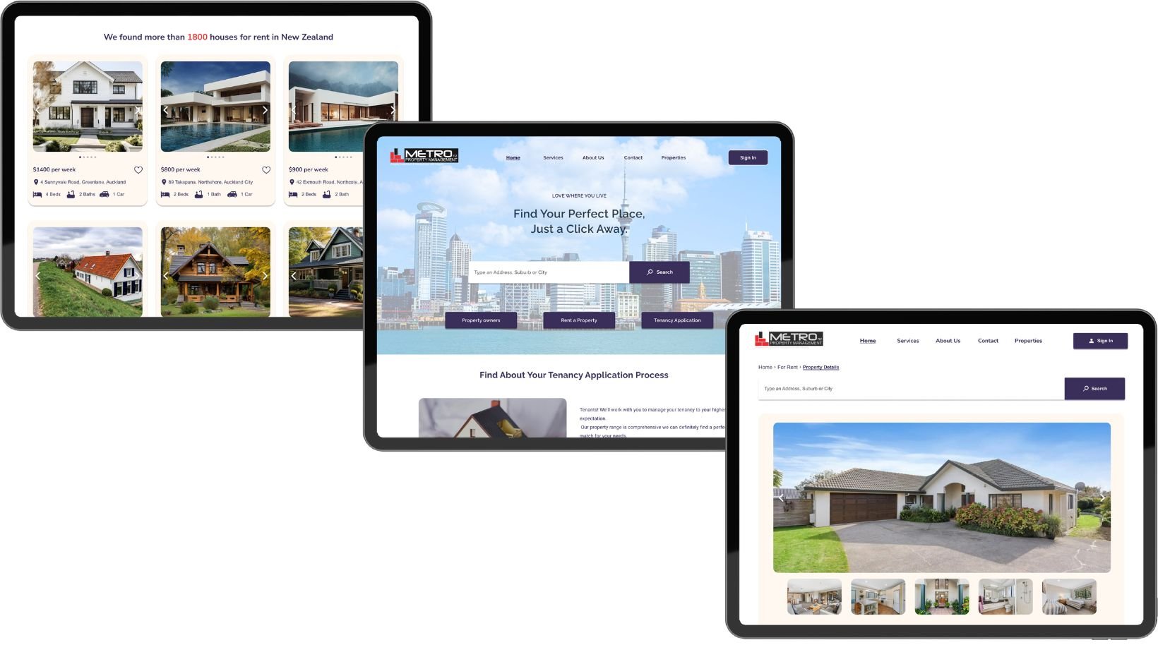
The functionality of the buttons and search bar on the landing page facilitates user input for specific addresses or locations, offering differentiation between services tailored for tenants and property owners. Furthermore, a distinct button is allocated specifically for accessing the tenancy application, ensuring clear and efficient navigation for users.
Proposed Design
#2: Upfront rental listings & Details
The rental listings page now features a list of properties, with detailed information and pictures available upon clicking on each property. Users can now effortlessly view property images and proceed to book a viewing or make inquiries directly with the property agent.
Proposed Design
#3: Tenancy Application
The "tenancy application" button was revised to provide clear information, ensuring users understand that clicking it does not commit them to a tenancy agreement but instead initiates the application process.
Proposed Design
Key Takeaways
Within a collaborative team environment encompassing both developers and UX designers, this project was a big chance for me to learn and grow. I got to improve my skills in understanding and defining problems, like a researcher. At the same time, I also got better at being a designer who understands what developers need.
Being part of the project right from the start taught me that good design comes from doing solid research and making sure it's right. This experience made me see how research and design go hand in hand, and it made me really curious about trying out research and design methods. I’m eager to keep getting better and making our future projects even more awesome.
