CRAFTING A SEAMLESS GYM LIFE : REVAMPING FOR LES MILLS TIMETABLE
Overview
A few weeks ago, I read a Medium article about Faang's UX story, which inspired me to create this case study. Thinking about my daily habits, the Les Mills app came to mind—it's where I spend most of my gym time and find happiness.
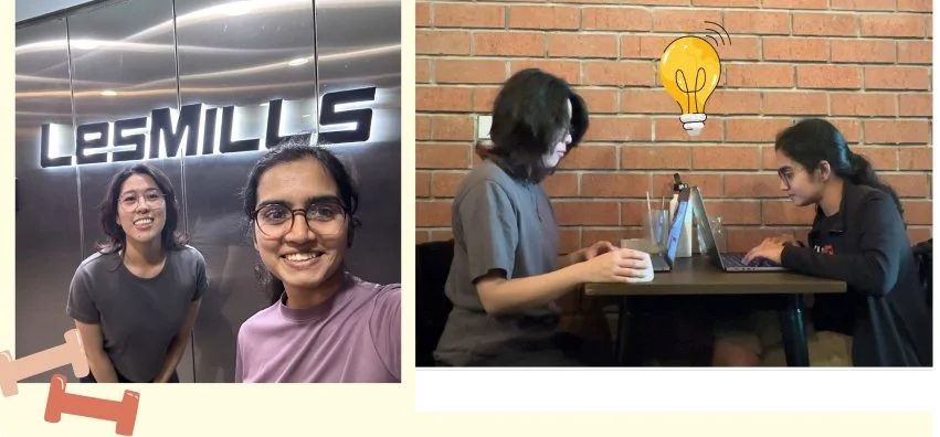
Les Mills is special to me; it was the first place I joined when I moved to New Zealand, and two years later, I still love it. So, I teamed up with my UX friend Lydia Chin to brainstorm and start this case study. It’s been a fun journey, full of passion and creativity, showing off our skills and making a great impression.
As a Les Mills member, I noticed some issues with their club membership app. It had a timetable and a scan code feature for club entry, but using it was a bit tricky. When I tried to view the timetable, scrolling wasn't smooth—it would jump around instead of moving smoothly. This frustration sparked my decision to revamp the app, starting with these user experience challenges I faced firsthand.
But hang on a minute,
Redesigning a product isn't as simple as diving in headfirst. Even though I was a club member myself, we made sure not to let bias sway our research. We wanted to hear from other users about their pain points and how they used the app. Understanding diverse user needs is key before starting any redesign.
UNDERSTANDING USER PAIN-POINTS
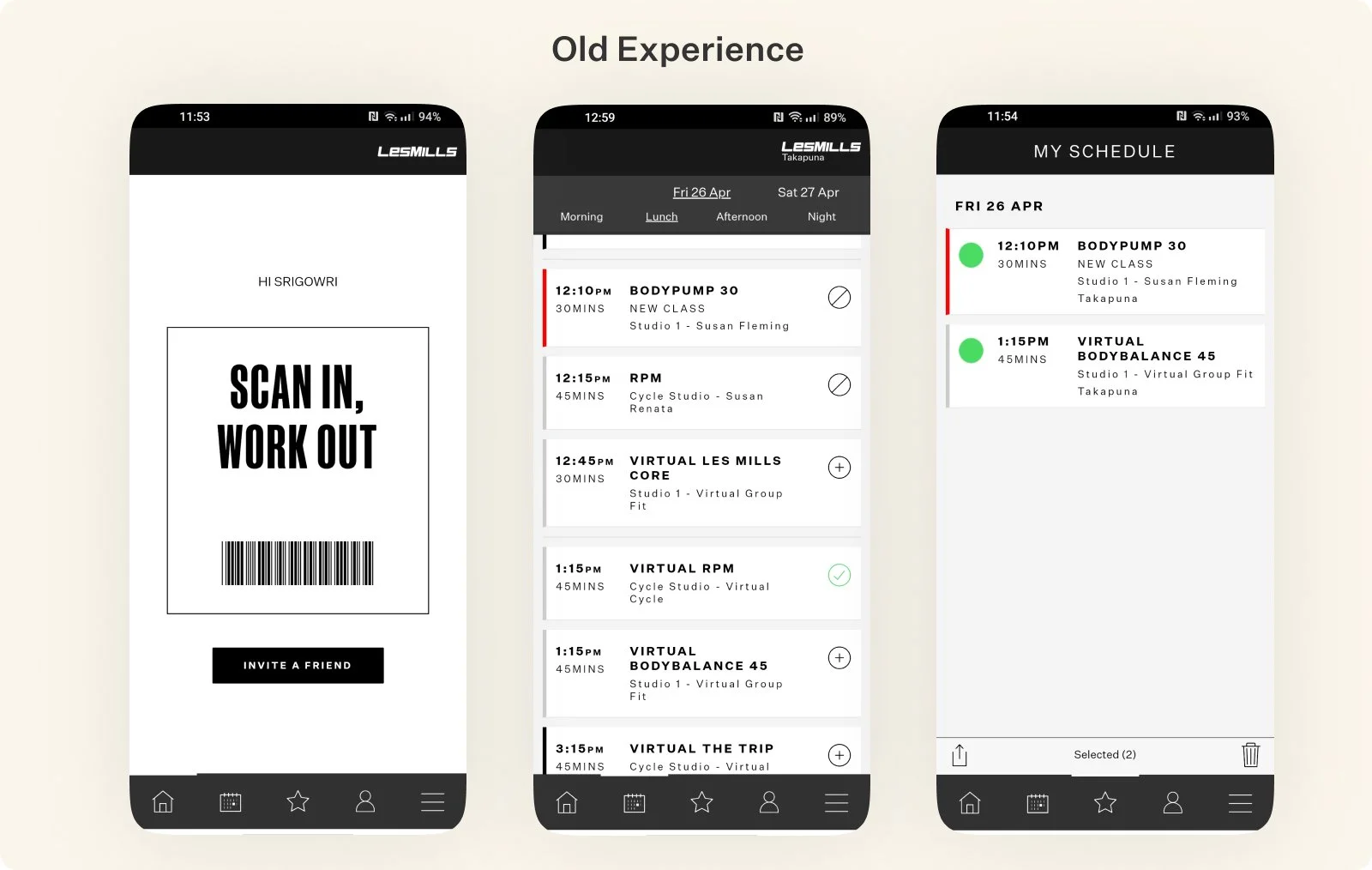
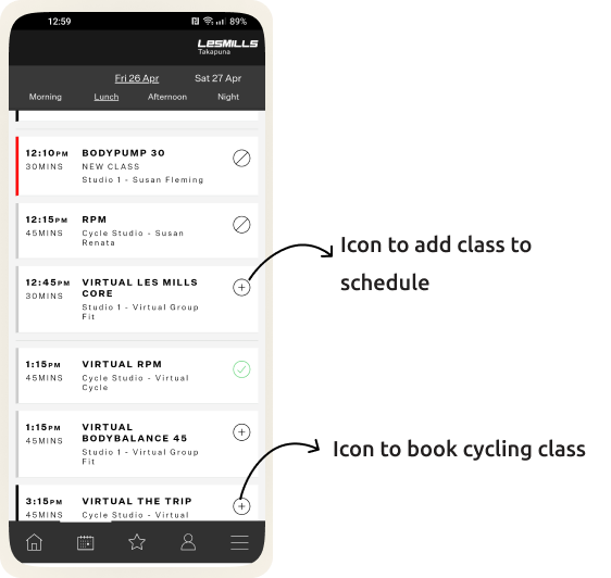
To understand where opportunities and challenges lay, it was important to start from observed problems with existing platform (screenshot below).
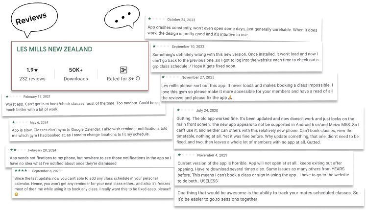
We started by gathering information. We did a user research by interviewing club members, and also collected the Google play store app reviews. We needed to understand their pain points with the existing UX. We could really empathise with them and they mentioned various aspects of the app needed improvements.
THE PROBLEMS WE WERE TRYING TO SOLVE
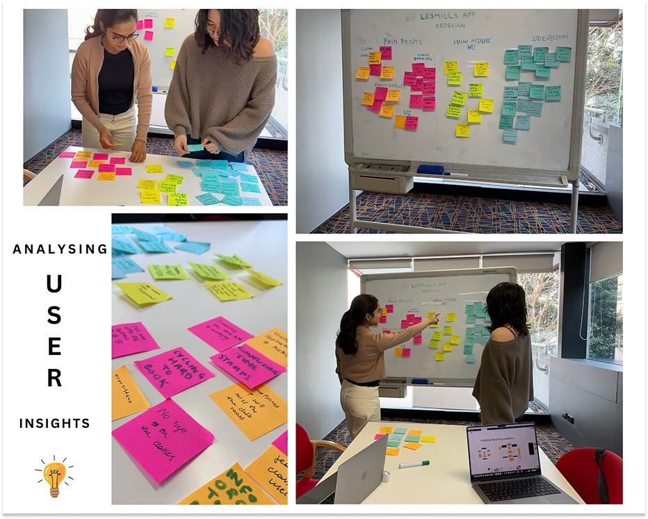
After understanding our user’s goals and painpoints, the user problems became a lot clearer. we took all my learnings from the heuristics research, conversations from the users and the google app store reviews, then narrowed in on our primary user problems.
Problem 1: Users found it tricky to access the timetable
When users opened the timetable, the first thing they did was scroll down to find their class information. However, if they accidentally scrolled up, the timetable would reset to the top, forcing them to scroll up and down several times to find the classes they needed.
Problem 2: Booking Frustrations - Unclear differentiation in Class Scheduling & booking classes.
Users found booking cycling class frustrating. All the classes had the same icon, and the buttons were confusing.
If bookings didn't go through, they had to call the gym to secure their spot. Additionally, it was difficult to see which classes they had successfully booked.
Problem 3: Unable to view class descriptions
Users wanting to try different classes often feel unsure if the class is right for them or not. They are overwhelmed by not knowing what equipment they need to take and are concerned about the class's intensity level. This uncertainty makes it difficult for them to confidently attend new classes.
Problem 4: Multiple apps are overwhelming for members
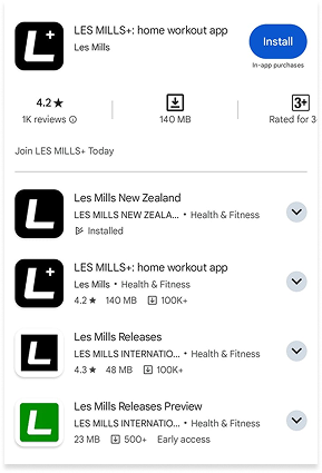
All Les Mills members have access to the At-home workouts, but they require a separate app to the Les Mills NZ timetable app. It's overwhelming to navigate between multiple apps and services each time.
SOLUTION
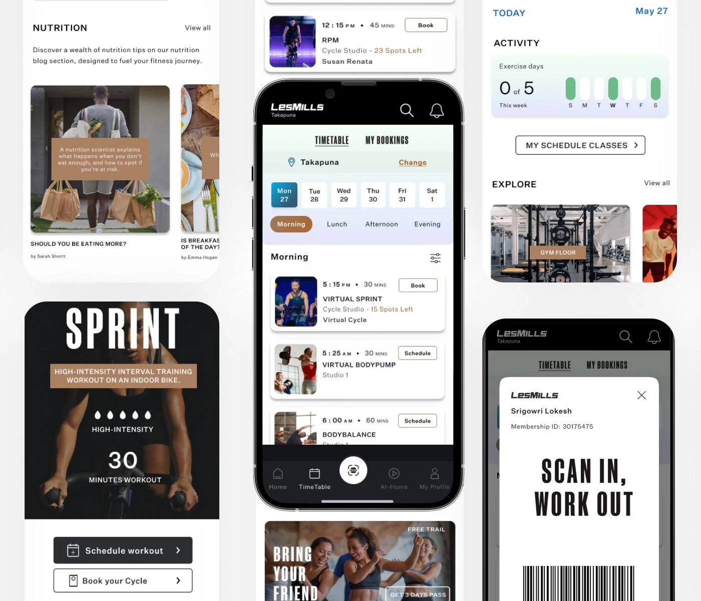
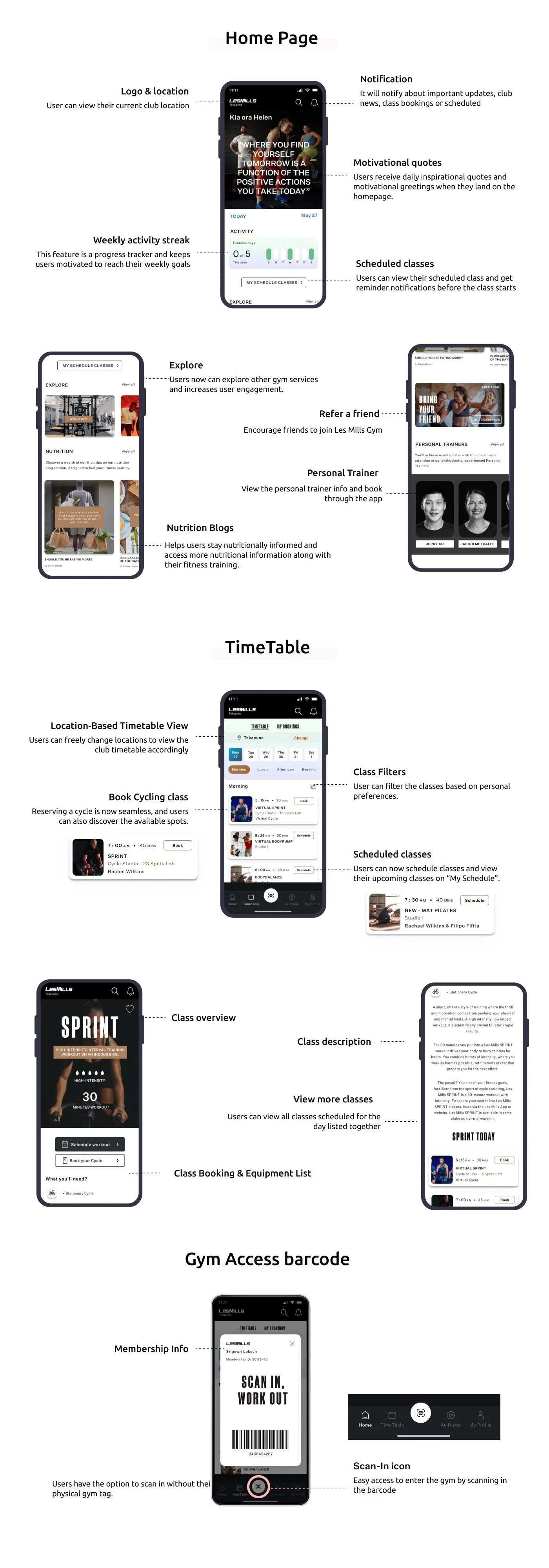
We officially committed to the redesign, recognising the users' problems and agreeing on which aspects of the user experience needed improvement. Success! The next steps involved redesigning the timetable app, which took several weeks of brainstorming, collaboration, and check-ins. We identified "how might we" questions from the pain points and generated ideas to address them.
TAKEAWAYS
This project was a significant learning experience, highlighting the importance of adaptability, effective recruitment, focused problem-solving, and collaboration. It underscored the need to stay passionate and persistent in the face of challenges. Our passion for UX design fueled our persistence. Despite the challenges, we completed the project and gained invaluable experience, reinforcing our commitment to creating user-centric designs.
